Upgrading Bootstrap
This blog is not intended to be an introduction into using Bootstrap, but rather showing some common CSS items that need to be modified in order to upgrade from versions 3 and 4 to version 5. This is also not intended to be a comprehensive list, but rather intended to show the various patterns that Bootstrap uses when upgrading to another version. Many items that change syntax from one version to another are simply eliminated. For example, data-target is used in previous versions of Bootstrap for collapse component, however that attribute is completely ignored in Bootstrap 5 and should be replaced with data-bs-target. There is no backwards compatibility for these attributes.
If you have some pages which have been upgraded and some which have not, it is fine to keep both the old and new CSS classes or attributes, Bootstrap 5 will ignore the old versions and vice versa.
Instead of dividing this between upgrading from 3 to 5 and from 4 to 5, all items have been included together. Many items have been eliminated or the syntax has changed subtly.
If you have a search and replace tool (Asponte offers one for HCL DX), this can be a relatively painless upgrade.
Why Upgrade
Bootstrap is always evolving. The newer versions make many things simpler as well as providing new components and new classes. A sample of the new classes include:
- row-cols-*. For example <div class=”row row-cols-2”><div class=”col”><div class=”col”><div class=”col”><div class=”col”></div> specifies two columns per row. Note this is specified on the row element not on the columns. This makes it easier to have a number of columns that aren’t factors of 12. Also includes row-cols-auto, so each column takes its natural width.
- fs-[1-6]. Ability to set font sizes, similar to the header classes, except these only set font size.
- border-[1-5]. New border width classes.Several new components have been added:
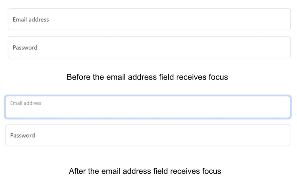
Floating label: For use in forms, these are labels that look like a placeholder, but when you click the label remains but floats upward in the input field.
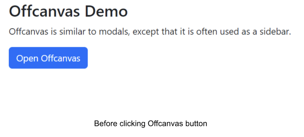
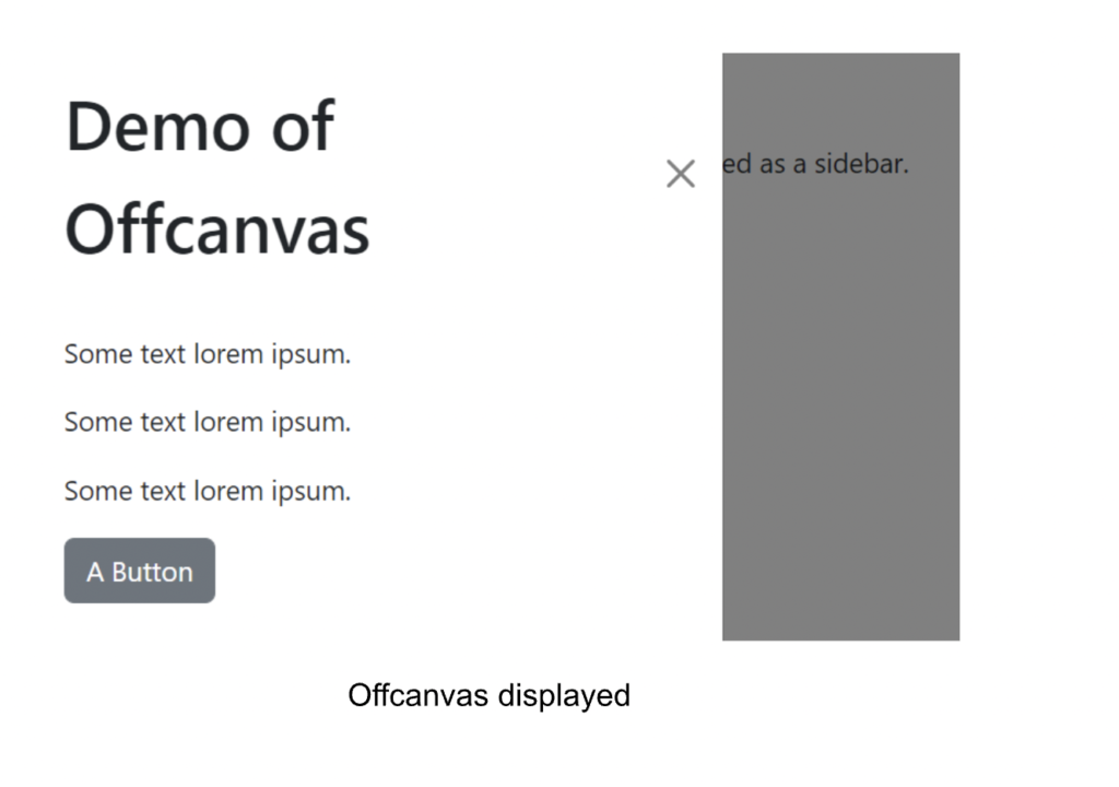
Offcanvas: this provides a flyout sidebar from the top, bottom, left, or right of the viewport. It can be activated by a button or Javascript.
Accordion: this used to be part of Collapse but is now its own component.
This is only a sample of the new features of Bootstrap 5. Note that Bootstrap 5 does not include jQuery, however, if you need it, you may include it separately and use jQuery to reference Bootstrap elements. More information may be found here.
New Attributes and Classes
| Previous Class | Bootstrap 5 Class | Notes |
| no-gutters | g-0 | |
| *-xs-* | N/A | The extra small breakpoint is no longer specified by using “xs”. Simply leave it out. For example, replace col-xs-12 with col-12. Both specify twelve columns for extra small screen sizes and up. |
| hidden-xs | d-none d-sm-block | hidden has been removed |
| visible-xs | d-block d-sm-none | visible has been removed |
| sr-only | visually-hidden | |
| col-md-push-8 col-md-pull-4
<div class=”col-md-9 col-md-push-3“>Appears 2nd</div> <div class=”col-md-3 col-md-pull-9“>Appears 1st</div> |
order-md-[1-5]
<div class=”col-md-9 order-md-2“>Appears 2nd</div> <div class=”col-md-3 order-md-1“>Appears 1st</div> |
The push and pull classes have been replaced by specifying the element order. For example order-1 specifies the item which should appear first. You may specify up to five elements with order-5. |
| float-left
float-right |
float-start
float-end |
Note classes with *-left and *-right have been replaced with *-start and *-end |
| ml-*
mr-* pl-* pr-* |
ms-*
me-* ps-* pe-* |
Similar to the above, classes designating left (l) and right (r) are now designated as start (s) and end (e). Top (t), bottom (b) and the x and y axes remain the same. |
| col-md-offset-3 | offset-md-3 | |
| data-toggle
data-target |
data-bs-toggle
data-bs-target |
Used in modals, collapse, navbars and navs. Note that all the data-* attributes have been modified to data-bs-* |
| embed-responsive embed-responsive-16by9 | ratio ratio-16×9 | Other included aspect ratios are 1×1, 4×3 and 21×9. |
| Bootstrap 3 Navbar example | ||
| <nav class=”navbar navbar-default“>
<div class=”container-fluid”> <div class=”navbar-header”> <a class=”navbar-brand” href=”#”>Navbar</a> </div> <ul class=”nav navbar-nav”> <li class=”active”><a href=”#”>Home</a></li> <li><a href=”#”>Features</a></li> <li><a href=”#”>Pricing</a></li> </ul> </div> </nav> |
||
| Bootstrap 5 Navbar example | ||
| <nav class=”navbar navbar-expand-lg“>
<div class=”container-fluid”> <a class=”navbar-brand” href=”#”>Navbar</a> <div class=”collapse navbar-collapse” id=”navbarNavDropdown”> <ul class=”navbar-nav”> <li class=”nav-item“><a class=”nav-link active” aria-current=”page” href=”#”>Home</a></li> <li class=”nav-item“><a class=”nav-link” href=”#”>Features</a></li> <li class=”nav-item“><a class=”nav-link” href=”#”>Pricing</a> </li> </ul> </div> </div> </nav> |
||
| Carousel Classes | ||
| Some carousel classes include the “bs” addition.
data-ride data-slide data-target |
data-bs-ride
data-bs-slide data-bs-target |
If the same code exists on a Bootstrap 4 and 5 page, both classes may be included. |
| item | carousel-item | |
| left carousel-control | carousel-control-prev | |
| right carousel-control | carousel-control-next | |
| glyphicon glyphicon-chevron-left | carousel-control-prev-icon | Icon pointing to previous item |
| glyphicon glyphicon-chevron-right | carousel-control-next-icon | Icon pointing to next item |
| Bootstrap 3 Carousel Example
(differences highlighted) |
||
| <div id=”carousel-example-generic” class=”carousel slide” data-ride=”carousel”>
<!– Wrapper for slides –> <div class=”carousel-inner” role=”listbox”> <div class=”item active”> … </div> </div> <div class=”item“> … </div> </div> … </div> <!– Controls –> <a class=”left carousel-control” href=”#carousel-example-generic” role=”button” data-slide=”prev”> <span class=”glyphicon glyphicon-chevron-left” aria-hidden=”true”></span> <span class=”sr-only“>Previous</span> </a> <a class=”right carousel-control” href=”#carousel-example-generic” role=”button” data-slide=”next”> <span class=”glyphicon glyphicon-chevron-right” aria-hidden=”true”></span> <span class=”sr-only“>Next</span> </a> </div> |
||
| Bootstrap 5 Carousel Example
(differences highlighted) |
||
| <div id=”carouselExampleControls” class=”carousel slide” data-bs-ride=”carousel”>
<div class=”carousel-inner”> <div class=”carousel-item active”> … </div> <div class=”carousel-item“> … </div> </div> <button class=”carousel-control-prev” type=”button” data-bs-target=”#carouselExampleControls” data-bs-slide=”prev”> <span class=”carousel-control-prev-icon” aria-hidden=”true”></span> <span class=”visually-hidden“>Previous</span> </button> <button class=”carousel-control-next” type=”button” data-bs-target=”#carouselExampleControls” data-bs-slide=”next”> <span class=”carousel-control-next-icon” aria-hidden=”true”></span> <span class=”visually-hidden“>Next</span> </button> </div> |
||
Need more help?
Send us a message – Contact


